
Case study
inquirED Rebrand
A company-wide rebrand: brand strategy and positioning through a complete visual identity system, built to give marketing, sales, and product one shared brand to work from.
What I did
- Led a company-wide rebrand: brand strategy and positioning through visual identity, messaging, and implementation.
- Partnered directly with executive leadership to define a clear brand strategy and personality ("The Coach"), aligning business goals with educator trust and credibility.
- Designed and built the complete visual identity system (logo, typography, color, illustration, iconography, and photography), down to final production details and color specifications.
- Developed brand architecture to support multiple products under a unified parent brand, setting a foundation for future launches without brand fragmentation.
- Created comprehensive brand guidelines and internal enablement tools, ensuring consistent adoption across marketing, sales, product, and internal communications.
Visual identity

Custom classroom B-roll built to capture the feeling of being inside a classroom full of activity, joy, and hard work.
Logo system & color


A refined logo system designed for accessibility, flexibility, and real-world use. The color language is built around the same balance as the brand itself: rigor and joy, sitting together.
What I loved about this project
I love branding. I love uncovering what makes a company special and creating a story and identity that feels like it could only belong to them. I'm always surprised by what emerges, and proud of the way great branding traces back to the people who built the thing.
And I loved getting to work with an exceptional photographer to capture custom photos that hum with classroom life. In a market where stock photos dominate, this was an easy win visually, and it turned into resonant moments that say more about our company than any number of mission statements.
Photography

I briefed, hired, and directed the photographer behind this photography, the hero of our brand system, and also art directed the B-roll captured in the same sessions. These images capture the focus and joy of teachers and students using our curricula, in a market where most competitors run on stock photos. Photography by Saverio Truglia.
Illustration
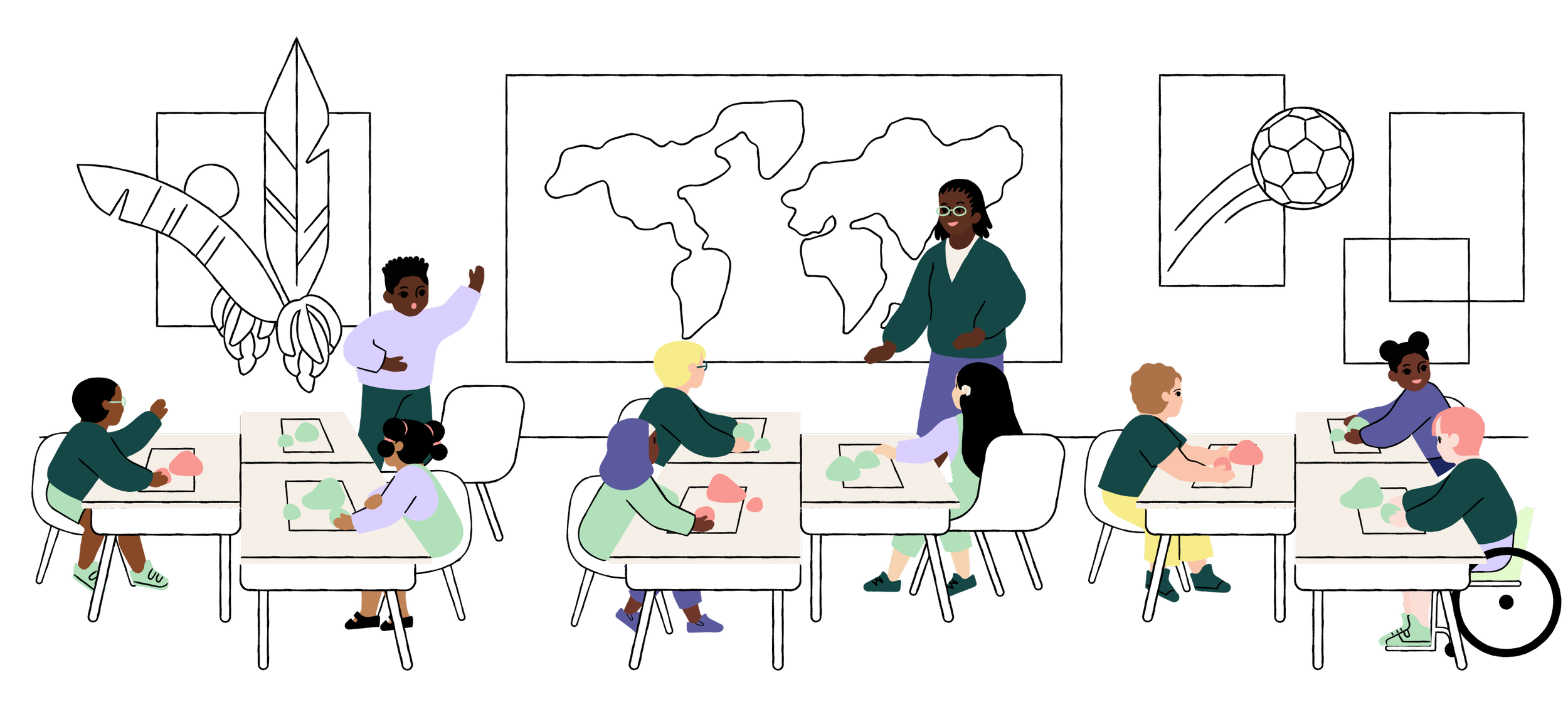
I sourced and art directed an illustrator to build our library of custom illustrations and animations, capturing the joy, wonder, and possibility of inquiry-based learning. Illustrations by Sabrena Khadija.
Internal rollout
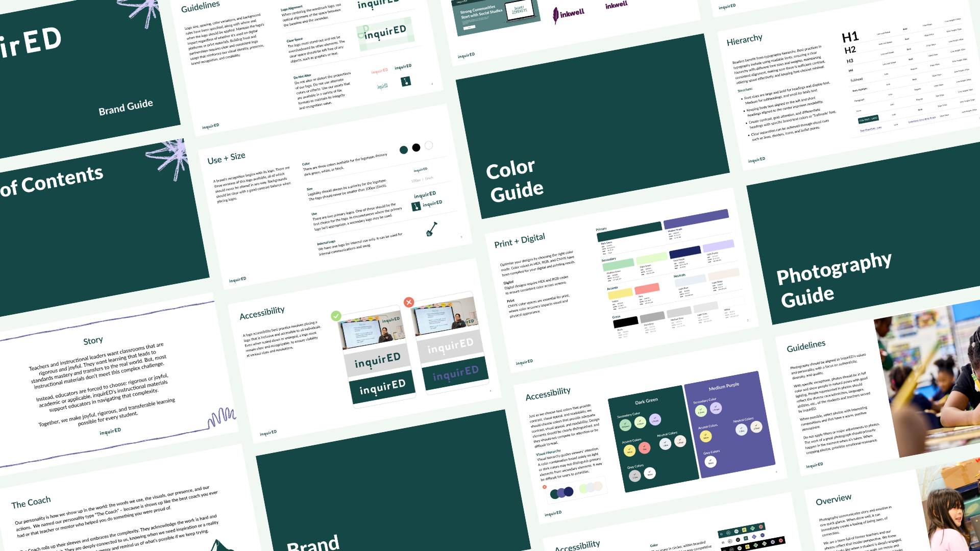
A flexible brand system designed to support marketing, sales, and product communication across channels. Internal brand rollout focused on alignment, clarity, and shared ownership.
Impact
The new identity gave marketing, product, and sales a shared system to work from.
The brand architecture means future product launches don't require starting over. After it shipped, a board member asked which agency we'd used. We hadn't.